Html 打乒乓球动画
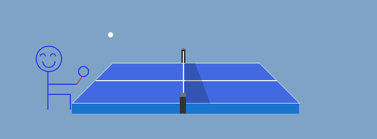
先看一下效果,电脑没有下录屏软件,所以只能截屏了。
先还是用div布局,,不多说,直接上代码吧。
css
<style> body { background: #7fa3c7; font-family: "Chewy", cursive; text-align: center; font-size: 50px; color: white; overflow: hidden; } #frame { margin: 0 auto; margin-top: 100px; position: relative; width: 446px; height: 220px; } #clrcle { position: absolute; top: 30px; left: 0px; border-bottom: 80px solid #fff; border-left: 80px solid transparent; border-right: 80px solid transparent; height: 0; width: 288px; height: 28px; } #clrcle:before { display: block; content: " "; position: absolute; top: 1px; left: -78px; border-bottom: 78px solid #4169e1; border-left: 78px solid transparent; border-right: 78px solid transparent; height: 0; width: 288px; height: 28px; } #clrcle:after { display: block; content: " "; position: absolute; top: 108px; left: -80px; height: 20px; width: 446px; background: #1874cd; } #crossing { position: absolute; position: absolute; width: 353px; top: 62px; left: -33px; height: 1; border: 1px solid white; } #cross_botton { position: absolute; top: 2px; margin-left: 135px; margin-right: 106px; width: 8px; height: 26px; background: #333; } /* 上部分加上小黑点 */ #cross_botton:before { display: block; content: " "; position: absolute; top: -3px; width: 4px; border-left: solid 2px transparent; border-right: solid 2px transparent; border-bottom: solid 3px rgb(115, 115, 115); } #cross_center { position: absolute; top: 5px; left: 138px; width: 2px; height: 102px; background: white; } #cross_top { position: absolute; top: 95px; left: 132px; width: 12px; height: 33px; background: #333; z-index: 1; } /* 下部分加上小黑点 */ #cross_top:before { display: block; content: " "; position: absolute; top: -8px; width: 10px; border-left: solid 1px transparent; border-right: solid 1px transparent; border-bottom: solid 8px rgb(115, 115, 115); } #cross_right { position: absolute; left: 142px; border-bottom: 80px solid rgba(0, 0, 0, 0.2); border-right: 30px solid transparent; height: 0; width: 20px; top: 28px; } </style>
html
<div id="frame"> <div id="clrcle"> <!-- 中间的横线 --> <div id="crossing"></div> <!-- 上边的褐黑色栏杆 --> <div id="cross_botton"></div> <!-- 栏杆中间白色部分 --> <div id="cross_center"></div> <!-- 下边的褐黑色栏杆 --> <div id="cross_top"></div> <!-- 栏杆右边加一条横线 --> <div id="cross_right"></div> </div> </div> <!--清除浮动 --> <div style="text-align:center;clear:both;"></div>
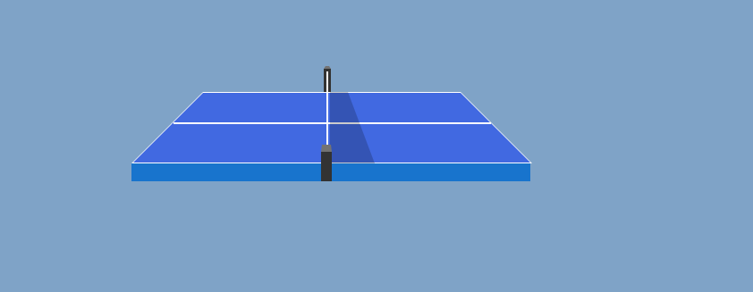
然后乒乓球台就布局好了,如下图:
继续搭建球来回滚动的div
css
#rectangle1, #rectangle2 { position: absolute; width: 360px; height: 360px; top: 28px; } #rectangle3, #rectangle4 { position: absolute; width: 180px; height: 180px; top: 28px; } #rectangle1 { top: -60px; right: 8px; animation: rotateC1 2s linear infinite; } #rectangle2 { top: -60px; left: 8px; animation: rotateC2 2s linear infinite; } #rectangle3 { top: 44px; right: 198px; animation: rotateC3 2s linear infinite; } #rectangle4 { top: 35px; left: 229px; animation: rotateC4 2s linear infinite; } /* @keyframes 使 div 元素匀速向下移动: */ @keyframes rotateC1 { 0% { opacity: 1; transform: rotate(-44deg); } 35% { opacity: 1; transform: rotate(60deg); } 36%, 100% { opacity: 0; } } @keyframes rotateC2 { 0%, 49% { opacity: 0; } 50% { opacity: 1; transform: rotate(44deg); } 85% { opacity: 1; transform: rotate(-60deg); } 86%, 100% { opacity: 0; } } @keyframes rotateC3 { 0%, 84% { opacity: 0; } 85% { opacity: 1; transform: rotate(39deg); } 100% { opacity: 1; transform: rotate(-15deg); } } @keyframes rotateC4 { 0%, 34% { opacity: 0; } 35% { opacity: 1; transform: rotate(-39deg); } 50% { opacity: 1; transform: rotate(15deg); } 51%, 100% { opacity: 0; } } #globe1, #globe2, #globe3, #globe4 { position: absolute; width: 10px; height: 10px; background: white; border-radius: 10px; } #globe1, #globe2 { top: -5px; left: 164px; } #globe3, #globe4 { top: -5px; left: 70px; }
View Codehtml
温馨提示: 本文由Jm博客推荐,转载请保留链接: https://www.jmwww.net/file/web/42364.html
- 上一篇:通过curl以及ping命令批量测试主机连通性
- 下一篇:自动上传Word图片功能.
![[转]Node.js中package.json中^和~的区别](/uploads/allimg/200519/054J34453_lit.png "[转]Node.js中package.json中^和~的区别")