标签:
1.指定文本前后添加内容
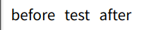
<div class="box">test</div>
.box::before{
content: 'before';
margin-right:10px ;
}
.box::after{
content: 'after';
margin-left:10px ;
}
2. 实现一个书签符号logo
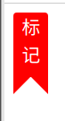
<div class="mark">
标<br>记
</div>
.mark{
width: 30px;
height: 55px;
color: #fff;
border-radius: 3px 3px 0 0;
background-color: red;
text-align: center;
position: relative;
&::after,&::before{
position: absolute;
content: '';
display: block;
border: 15px solid transparent;
}
&::after{
right: 0;
border-right: 15px solid red;
bottom: -15px;
}
&::before{
left: 0;
border-left: 15px solid red;
bottom: -15px;
}
}
3.文字前后自动加上引号
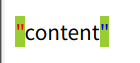
<div class="code">
content
</div>
.code{
margin-top: 20px;
&::before{
content: "\"";
color: red;
}
&::after{
content: "\"";
color: blue;
}
&:hover{
&::before,&::after{
background-color: yellowgreen;
}
}
}
4.自界说样式实现checkbox
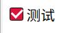
<label for="moreAction">
<input id="moreAction" type="checkbox">
<span class="fw-checkbox"></span>
<span>测试</span>
</label>
#moreAction{
display: none;
}
.fw-checkbox{
position: relative;
display: inline-block;
box-sizing: border-box;
width: 15px;
height: 15px;
border: 1px solid #000;
border-radius: 2px;
}
#moreAction[type="checkbox"]:checked{
+.fw-checkbox{
background-color: crimson;
}
+.fw-checkbox::before{
position: absolute;
display: inline-block;
content: '';
width: 6px;
height: 10px;
border-right: 2px solid #fff;
border-bottom: 2px solid #fff;
transform: rotate(45deg);
left: 3px;
bottom: 3px;
}
}
简单实现一个聊天气泡
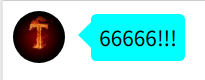
<div class="bubble">
<img src=http://www.mamicode.com/"http:/img.cdn.sugarat.top/mdImg/MTU3OTY5OTUwMDM1Mw==579699500353" alt="">
<div class="chat">66666!!!</div>
</div>
.bubble{
display: flex;
align-items: center;
img{
width: 40px;
height: 40px;
border-radius: 50%;
margin-right: 20px;
}
.chat{
position: relative;
background-color: cyan;
padding: 6px;
border-radius: 4px;
box-sizing: border-box;
&::before{
content: '';
position: absolute;
left: -20px;
border: 10px solid transparent;
border-right: 10px solid cyan;
}
}
}
6. 相片堆叠
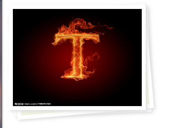
<div class="img-area">
<div class="pic">
<img src=http://www.mamicode.com/"http:/img.cdn.sugarat.top/mdImg/MTU3OTY5OTUwMDM1Mw==579699500353" alt="">
</div>
</div>
.pic{
position: relative;
img{
width: 100%;
height: 100%;
}
}
.pic,
.pic::after,
.pic::before{
width: 200px;
height: 150px;
border: 6px solid #fff;
box-shadow: 2px 2px 5px #ddd;
}
.pic::after,
.pic::before{
content: '';
position: absolute;
background:#eff4de ;
border: 6px solid #fff;
}
.pic::after{
transform: rotate(-2deg);
z-index: -2;
left: 0px;
}
.pic::before{
transform: rotate(-5deg);
z-index: -1;
left: 0px;
}
参考链接
掘金:CSS伪元素:before和:after介绍
css伪元素::before与::after使用根本示例
标签:
原文地点:https://www.cnblogs.com/roseAT/p/12229722.html
,
![[转]Node.js中package.json中^和~的区别](/uploads/allimg/200519/054J34453_lit.png "[转]Node.js中package.json中^和~的区别")