body {height: 100%;font: 20px/20px "microsoft yahei";}.row {
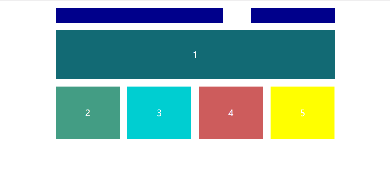
构造功效图:
电脑全屏:
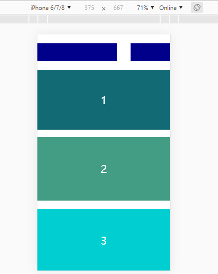
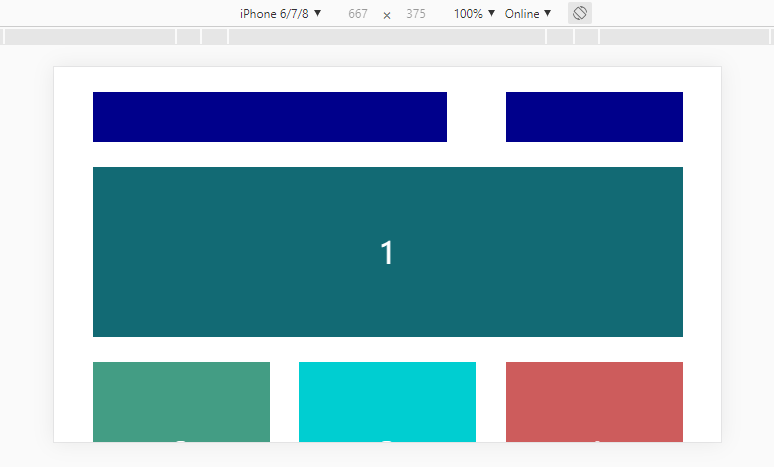
手机浏览:
竖屏:
横屏:
代码:
<!DOCTYPE html> <html> <head> <meta charset="UTF-8"> <title>响应式构造</title> <meta content="width=device-width,initial-scale=1,minimum-scale=1,maximum-scale=1,user-scalable=no" /> <style type="text/css"> * { margin: 0; padding: 0; } html, body { height: 100%; font: 20px/20px "microsoft yahei"; } .row { width: 960px; font-size: 30px; margin: 0 auto; margin-top: 25px; } #header{ height: 50px; } #header-left{ width: 60%; height: 50px; float: left; background: #00008B; } #header-right{ width: 30%; height: 50px; float: right; background: #00008B; } #div1{ height: 170px; color: #fff; line-height: 170px; text-align: center; background: #126a74; } #main{ height: 200px; display: flex; justify-content: space-between; } #main div{ width: 220px; height: 180px; color: #fff; line-height: 180px; text-align: center; /* float: left; */ } #div2{ background: #439d84; } #div3{ background: #00CED1; } #div4{ background: #CD5C5C; } #div5{ background: #FFFF00; } /*0-480手机*/ @media only screen and (min-width:0px) and (max-width:500px) { .row { width: 100%; } #main { align-items: center; flex-direction: column; margin-top: 20px; width: 100%; height: 790px; } #main div{ width: 100%; } } /*600-750平板,手机横屏*/ @media only screen and (min-width: 510px) and (max-width: 750px) { .row { width: 590px; } #main{ flex-wrap: wrap; justify-content: space-between; align-content: flex-start; height: 400px; } #main div{ width: 30%; height: 180px; margin-bottom: 25px; } } /* ipa */ @media only screen and (min-width: 750px) and (max-width: 780px) { .row { width: 600px; } #main{ flex-wrap: wrap; justify-content: space-between; align-content: flex-start; height: 400px; margin-top: 50px; } #main div{ width: 44%; height: 250px; margin-bottom: 30px; } } /* 全屏 */ @media only screen and (min-width:960px) { .row { width: 960px; } } </style> </head> <body> <div> <div> <div></div> <div></div> </div> <div>1</div> <div> <div>2</div> <div>3</div> <div>4</div> <div>5</div> </div> </div> </body> </html>
CSS3响应式构造案例
,温馨提示: 本文由Jm博客推荐,转载请保留链接: https://www.jmwww.net/file/web/30616.html
![[转]Node.js中package.json中^和~的区别](/uploads/allimg/200519/054J34453_lit.png "[转]Node.js中package.json中^和~的区别")